import ee

# init google earth engine with my project ID
# note that this requires manual setup via your google account
ee.Authenticate()
ee.Initialize(project='cdl-drought-monitor')I’ve been wanting to dive into GIS/remote sensing data for some time now. The last two projects I worked on were several years ago; one using R to visualize voting behavior in the swing state of Ohio, and another using d3.js for visualizing cell phone usage in third world countries.
Inspiration for this post came from news of rising oil/commodity prices and inflation. Instead of oil though, I thought it would be interesting to look at a commodity like corn, which is grown more in the US than any other country. Corn is also the backbone of our food supply and even serves as the primary feed for another commodity, cattle. From an analytical perspective, corn covers large areas of land which in turn lends well to geographic analysis. Practically speaking, an accurate assessment of corn could not only be useful for predicting commodity prices but could also some an indication of future food/beef prices at the grocery store.
So my main goal is to explore the relationship between corn crops and corn/beef futures prices. And there’s no better state than Iowa for this, they even have a song about it. But before I jump into financial data and statistical modeling, this post will focus on getting familiar with Google Earth Engine (GEE) and it’s python API. That’s the tool I’ll use to gather the agricultural data and perform basic vegetation analysis. A follow-up post will be dedicated to building the time series data and modeling.
Geographic Boundary and Cropland Data Layer
Before the satellite imagery, I need a geographic boundary for the state of Iowa. For this I can use the TIGER dataset (Topologically Integrated Geographic Encoding and Referencing) which is provided by the US Census Bureau. This massive vector dataset contains precise boundaries for states, counties, and even roads and rivers.
Once I have the boundary, I can use it to filter the USDA Cropland Data Layer (CDL). CDL is a crop-specific land cover data layer by the National Agricultural Statistics Service (NASS) created with satellite imagery.
# get geographic boundary for Iowa

# GEE hosts TIGER as a FeatureCollection since it is vector data set (no shapefiles)
states = ee.FeatureCollection("TIGER/2018/States")
iowa = states.filter(ee.Filter.eq('NAME', 'Iowa')).geometry()
# import io
# import requests
# from PIL import Image as PILImage
# # plot on GEE servers using EE API and download png BUT this can take some time
# image_url = ee.Image().paint(iowa, 1, 3).getThumbURL({
# 'region': iowa.buffer(10000),
# 'dimensions': 600,
# 'format': 'png',
# 'palette': ['FF6347']
# })
# img = PILImage.open(io.BytesIO(requests.get(image_url).content))
# plt.figure(figsize=(8, 8))
# plt.imshow(img)
# plt.axis('off')
# plt.title('Iowa State Boundary')
# plt.show()import geopandas as gpd
import matplotlib.pyplot as plt
from matplotlib.ticker import FuncFormatter
import pyproj
# convert GEE vectors to geo json dictionary and load to geopandas geodataframe
iowa_geojson_dict = iowa.getInfo()
gdf_iowa = gpd.GeoDataFrame.from_features([
{'type': 'Feature', 'geometry': iowa_geojson_dict, 'properties': {}}
])
# project for visual shape
gdf_iowa.crs = "EPSG:4326"
gdf_iowa_projected = gdf_iowa.to_crs("EPSG:3857")
fig, ax = plt.subplots(figsize=(10, 10))
gdf_iowa_projected.plot(ax=ax, color='none', edgecolor='#333333', linewidth=2)
# maintain natural proportions
ax.set_aspect('equal')
# format axes to show lat/lon even though we are in a projected space
# take the projected meter values and convert back to degrees for labels
projector = pyproj.Transformer.from_crs("EPSG:3857", "EPSG:4326", always_xy=True)
def format_lon(x, pos):
lon, lat = projector.transform(x, 0)
return f"{lon:.1f}°W"
def format_lat(y, pos):
lon, lat = projector.transform(0, y)
return f"{lat:.1f}°N"
ax.xaxis.set_major_formatter(FuncFormatter(format_lon))
ax.yaxis.set_major_formatter(FuncFormatter(format_lat))
ax.set_title('Iowa State Boundary (Projected)')
ax.set_xlabel('Longitude')
ax.set_ylabel('Latitude')
plt.grid(True, linestyle='--', alpha=0.5)
plt.show()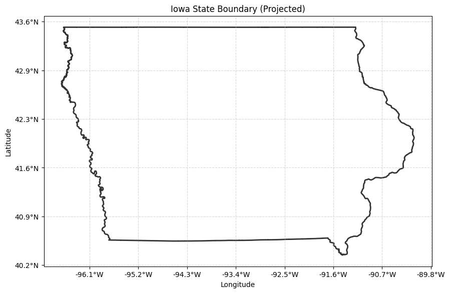
Now to get the remote sensing data for corn. CDL is raster data, and within it each pixel is assigned a value based upon the crop or vegetation type. For corn the value is 1, but for soybean it’s 5 and for pasture it’s 176. This is conventient because it allows us to create a binary mask and easily filter for corn. CDL comes in a 30 meter resolution (or 10 meter for year 2024 and later), so this is very fine grain.
cdl_raw = ee.Image("USDA/NASS/CDL/2023")
cdl_iowa_cropland = cdl_raw.select('cropland').clip(iowa)

# creates a binary mask
cdl_iowa_corn_mask = cdl_iowa_cropland.eq(1)  # 1=corn, 5=soybean, 176=pasture

# get color info
cdl_palette = cdl_raw.get('cropland_class_palette').getInfo().split(',')
cdl_names = cdl_raw.get('cropland_class_names').getInfo().split(',')
values_raw = cdl_raw.get('cropland_class_values').getInfo()
cdl_values = [int(v) for v in values_raw.split(',')] if isinstance(values_raw, str) else [int(v) for v in values_raw]

val_to_name = dict(zip(cdl_values, cdl_names))
val_to_color = dict(zip(cdl_values, cdl_palette))
Even though my objective here is to look at land designated as corn, it’s worth taking a look at all pixel types. I’m curious about what is covered in this dataset but it could also be useful for future projects. So below, I’ll render the full pallette of pixel types and give some indication of the most frequent.
import io
import requests
from PIL import Image as PILImage
import matplotlib.patches as mpatches

# create full CDL palette image on EE servers and retrieve
full_vis_image = cdl_iowa_cropland.visualize(min=0, max=255, palette=cdl_palette)
full_thumb_url = full_vis_image.getThumbURL({
    'region': iowa,
    'dimensions': 2000,
    'format': 'png'
})
full_img = PILImage.open(io.BytesIO(requests.get(full_thumb_url).content))

# way too many types of land so just highlight top 10
full_histogram = cdl_iowa_cropland.reduceRegion(
    reducer=ee.Reducer.frequencyHistogram(),
    geometry=iowa,
    scale=500,  # finer scale for better top 10 accuracy
    maxPixels=1e13
).get('cropland').getInfo()

full_hist_processed = {int(k): v for k, v in full_histogram.items() if k != '0'}
top_10 = sorted(full_hist_processed.items(), key=lambda x: x[1], reverse=True)[:10]

top_10_names = [val_to_name.get(k, f'ID {k}') for k, v in top_10]
top_10_counts = [v for k, v in top_10]
top_10_colors = [f"#{val_to_color[k]}" for k, v in top_10]

# plot histogram like a legend
fig, axes = plt.subplots(1, 2, figsize=(12, 6))

axes[0].imshow(full_img)
axes[0].axis('off')
axes[0].set_title('Iowa 2023: Full Land Cover Palette', fontsize=10)

axes[1].barh(top_10_names, top_10_counts, color=top_10_colors, edgecolor='black')
axes[1].invert_yaxis() # Highest at the top
axes[1].set_title('Top 10 Land Cover Categories', fontsize=10)
axes[1].set_xlabel('Approximate Area (500m pixel count)')

plt.tight_layout()
plt.show()

print(f"total number of categories {len(full_hist_processed)}")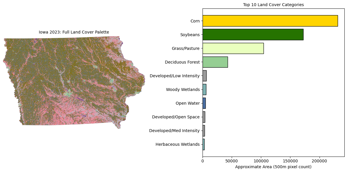
total number of categories 31With 31 categories, the full CDL palette is too large for a small rendering and colors are overlapping making it difficult to see the most frequent pixel types. For the sake of good visualization, I’ll filter to keep the top 3; corn, soybeans, and pasture.
top_3_ids = [1, 5, 176]
top_3_names = [val_to_name[k] for k in top_3_ids]
top_3_colors_hex = [val_to_color[k] for k in top_3_ids]
top_3_counts = [full_hist_processed.get(k, 0) for k in top_3_ids]

# Remap Top 3 to discrete range [0, 1, 2] and mask everything else
remapped_cdl = cdl_iowa_cropland.remap(top_3_ids, [0, 1, 2], -1)

vis_params = {
    'min': 0,
    'max': 2,
    'palette': top_3_colors_hex,
    'region': iowa,
    'dimensions': 2000,
    'format': 'png'
}

thumb_url = remapped_cdl.getThumbURL(vis_params)
img = PILImage.open(io.BytesIO(requests.get(thumb_url).content))

fig, ax = plt.subplots(figsize=(10, 10))

ax.imshow(img)
ax.axis('off')
ax.set_title('Iowa 2023: Top 3 Land Covers', fontsize=10)

legend_patches = [mpatches.Patch(color=f"#{top_3_colors_hex[i]}", label=top_3_names[i]) for i in range(3)]
ax.legend(handles=legend_patches, loc='upper right', framealpha=1.0, fontsize=10)

plt.show()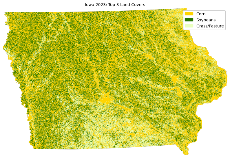
Even with just the top 3 categories, because my CDL data is at 30 meter resolution, it’s still difficult to see where corn is located. So I will keep it simple and just use pixels designated as corn crop.
# get image vectors so it's accurate no matter the resolution
corn_vectors = cdl_iowa_corn_mask.selfMask().reduceToVectors(
    geometry=iowa,
    scale=1000,
    # 1000 is good scale and still stay with EE's limit.
    # if scale=500 takes too long for GEE to respond and query gets aborted.
    # "Collection query aborted after accumulating over 5000 elements."
    geometryType='polygon',
    eightConnected=True,
    labelProperty='corn',
    maxPixels=1e9
)

# convert to geo pandas and reproject to mercator
corn_geojson = corn_vectors.getInfo()
gdf_corn = gpd.GeoDataFrame.from_features(corn_geojson, crs="EPSG:4326").to_crs("EPSG:3857")

# plot on top of existing projected iowa boundary
fig, ax = plt.subplots(figsize=(12, 12))

gdf_iowa_projected.plot(ax=ax, color='none', edgecolor='#333333', linewidth=1.5, zorder=2)

# plot corn distribution as black polygons, the darker the denser at 1km scale
gdf_corn.plot(ax=ax, color='black', alpha=0.75, zorder=1)

ax.xaxis.set_major_formatter(FuncFormatter(format_lon))
ax.yaxis.set_major_formatter(FuncFormatter(format_lat))
ax.set_title('Iowa 2023 Corn Distribution (Vectorized, 1km Scale)', fontsize=16)

ax.set_facecolor('white')
ax.set_aspect('equal')
plt.grid(True, linestyle='--', alpha=0.3, color='gray')

plt.show()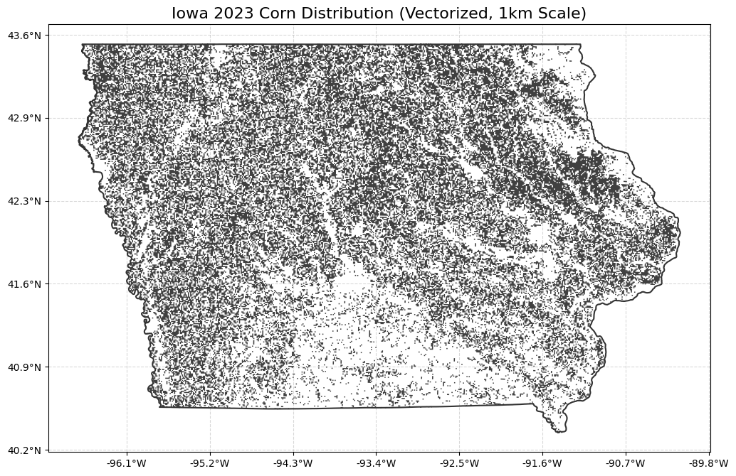
Infrared Light and Vegetation Index
… now onto analyzing agricultural health. To do this I’ll be using the GEE catalog to extract Moderate Resolution Imaging Spectroradiometer (MODIS) data (raster like CDL). MODIS is part of NASA’s Earth Observation System (EOS) imagery and measurements data and part of this includes bands in the infrared spectrum (thanks to NASA’s Terra and Aqua satellites, which btw are both now aging at 20+ years). Healthy vegetation reflects more light in near-infrared (NIR) bands and these values are used along with red light reflectance to calculate a normalized vegatation index (NDVI).
NDVI = (NIR - Red) / (NIR + Red)
The full index goes from -1.0 to 1.0 and several ranges within can be used to estimate different geographic features as well as distinguish vegetation health.
| Value Range | Real-World Meaning |
|---|---|
| -1.0 to 0.0 | Water bodies, snow, or clouds. |
| 0.0 to 0.2 | Bare soil, rock, or dead/dormant fields. |
| 0.2 to 0.5 | Sparse vegetation, shrubs, or highly stressed pastures. |
| 0.6 to 0.9 | Dense, highly active, healthy green vegetation. |
California Winter Reflectance
… to get an idea of the NDVI across varying geography let’s take a look at the state of California in the late winter which should include snow/ice. There are several MODIS collections in the GEE catalog, MODIS/061/MOD13Q1 masks the data to exclude non-land features but MODIS/061/MOD09A1 includes the full surface reflectance. This collection doesn’t come with NDVI so we’ll have to calculate it manually. This dataset also has images roughly every week, so we’ll take median across that time period which should help to reduce any artifacts or noise due to clouds or imperfect sensors …
import matplotlib.cm as cm
from matplotlib.colors import Normalize

# get CA geometry for boundary
california = states.filter(ee.Filter.eq('NAME', 'California')).geometry()
ca_geojson = california.getInfo()
gdf_ca = gpd.GeoDataFrame.from_features([{'type': 'Feature', 'geometry': ca_geojson, 'properties': {}}])
gdf_ca.crs = "EPSG:4326"
gdf_ca_projected = gdf_ca.to_crs("EPSG:3857")

# get raw MODIS surface reflectance in Feb
# there are 4 images here so take the median
mod09_ca_winter = ee.ImageCollection("MODIS/061/MOD09A1") \
    .filterDate('2023-02-01', '2023-02-28') \
    .filterBounds(california) \
    .median() \
    .clip(california)

# calculate NDVI
ca_raw_ndvi = mod09_ca_winter.normalizedDifference(['sur_refl_b02', 'sur_refl_b01'])

# coordinate reference system mercator
vis_params_ca = {'min': -1, 'max': 0.9, 'palette': ['blue', 'white', 'red']}
ca_raw_url = ca_raw_ndvi.visualize(**vis_params_ca).getThumbURL({
    'region': california,
    'dimensions': 2000,
    'format': 'png',
    'crs': 'EPSG:3857'
})
ca_raw_img = PILImage.open(io.BytesIO(requests.get(ca_raw_url).content))

# plot
fig, ax = plt.subplots(figsize=(12, 12))

bounds = gdf_ca_projected.total_bounds
ax.imshow(ca_raw_img, extent=[bounds[0], bounds[2], bounds[1], bounds[3]])

gdf_ca_projected.plot(ax=ax, color='none', edgecolor='black', linewidth=1.2, alpha=0.8)

mappable = cm.ScalarMappable(norm=Normalize(vmin=-1.0, vmax=0.9), cmap=cm.RdBu_r)
cbar = fig.colorbar(mappable, ax=ax, orientation='vertical', fraction=0.03, pad=0.04)

ax.xaxis.set_major_formatter(FuncFormatter(format_lon))
ax.yaxis.set_major_formatter(FuncFormatter(format_lat))

ax.set_title('California NDVI Late Winter 2023', fontsize=10)
ax.set_aspect('equal')
plt.grid(True, linestyle='--', alpha=0.3)
plt.show()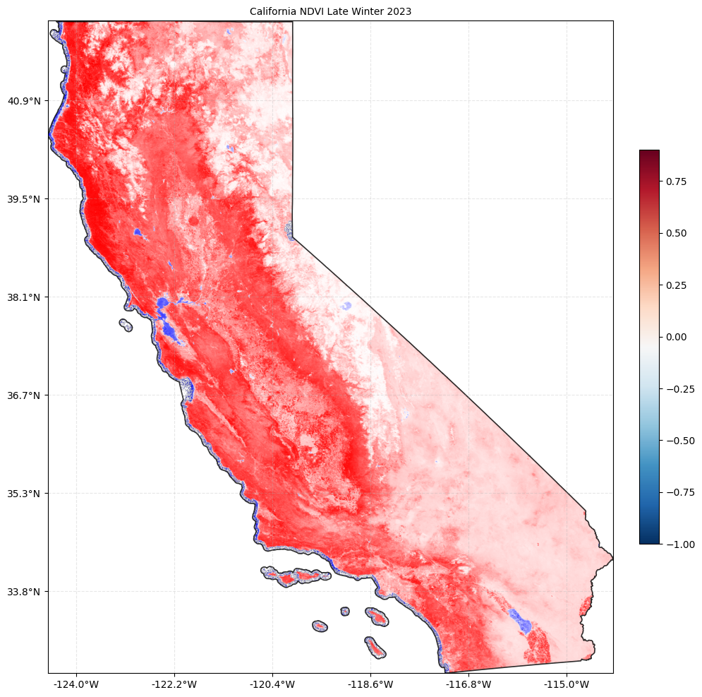
.. can see that salton sea, SF bay, various coastline as blue while Sierra Nevada snowpack is white, and Mojave and surrounding desert / shrub areas as more gray although that could also be cloud cover. the central valley and northern california are noticeably more red.
… since we aren’t concerned water bodies, snow, or clouds we can restrict the MODIS data from 0 to 0.9 (i.e. use the masked data) which is more useful for corn vegetation analysis. for the sake interpretability, I’ll give the lower end of the color range a brown color and higher values green. the plot below doesn’t filter for corn, but it does illustrate the progression of vegetation health coming out of winter and going into spring…
note that this filtered dataset is at half the frequency of the raw MODIS data, so twice a month. but since we look across 2 months of data for each image, the median is still an effective reduction technique to filter out noisy NDVI values…
import matplotlib.cm as cm
from matplotlib.colors import LinearSegmentedColormap, Normalize

# get standard MODIS masked data which already comes with NDVI layer
modis_standard = ee.ImageCollection("MODIS/061/MOD13Q1").select('NDVI')

# compare winter through late spring in chunks of 2 full months
periods = [
    ('Jan-Feb', '2023-01-01', '2023-02-28'),
    ('Mar-Apr', '2023-03-01', '2023-04-30'),
    ('May-Jun', '2023-05-01', '2023-06-30'),
    ('Jul-Aug', '2023-07-01', '2023-08-31'),
]

# palette is Brown -> White -> Green; 0=Brown, 0.9=Green
custom_palette = ['#8B4513', '#FFFFFF', '#228B22']
vis_params = {'min': 0, 'max': 9000, 'palette': custom_palette}

def fetch_seasonal_thumb(start, end):
    img = modis_standard.filterDate(start, end).filterBounds(iowa).median().clip(iowa)
    url = img.visualize(**vis_params).getThumbURL({
        'region': iowa,
        'dimensions': 1000,
        'format': 'png',
        'crs': 'EPSG:3857'
    })
    return PILImage.open(io.BytesIO(requests.get(url).content))

# plot seasonal 2x2 grid
fig, axes = plt.subplots(2, 2, figsize=(12, 10))
axes = axes.flatten()

for i, (label, start, end) in enumerate(periods):
    img = fetch_seasonal_thumb(start, end)
    axes[i].imshow(img, extent=[gdf_iowa_projected.total_bounds[0], gdf_iowa_projected.total_bounds[2],
                                gdf_iowa_projected.total_bounds[1], gdf_iowa_projected.total_bounds[3]])
    gdf_iowa_projected.plot(ax=axes[i], color='none', edgecolor='black', linewidth=1, alpha=0.6)
    axes[i].set_title(f'{label} 2023', fontsize=8)
    axes[i].axis('off')

# matching colormap for the colorbar
br_gn_cmap = LinearSegmentedColormap.from_list("brown_green", custom_palette)
mappable = cm.ScalarMappable(norm=Normalize(vmin=0, vmax=0.9), cmap=br_gn_cmap)
cbar = fig.colorbar(mappable, ax=axes.tolist(), orientation='horizontal', fraction=0.03, pad=0.05)
cbar.set_label('NDVI', fontsize=10)

plt.suptitle('Iowa NDVI Seasonal Progression', fontsize=10, y=0.95)
plt.show()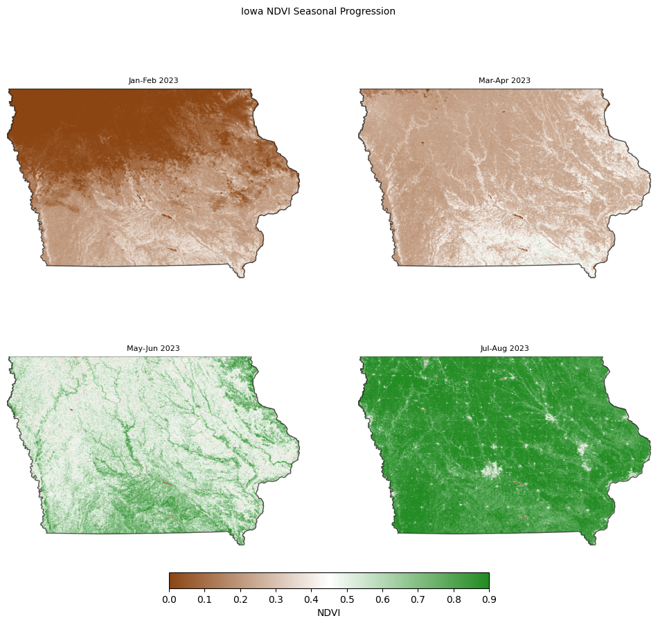
… one interesting but perhaps expected note here to confirm our data integrity, is that southern latitudes seem to get healthier earlier than northern ones do …
now let’s filter for corn using the CDL data. MODIS data is at 250 meter spatial resolution whereas the CDL, as mentioned, is much higher. So we’ll need to aggregate and reduce the CDL data so that we can match the NDVI patches …
# pretty simple API with GEE just 'update mask'
def fetch_corn_masked_thumb(start, end):

    # get median NDVI for period
    img = modis_standard.filterDate(start, end).filterBounds(iowa).median().clip(iowa)

    # apply CDL corn mask to isolate corn pixels
    corn_img = img.updateMask(cdl_iowa_corn_mask)

    url = corn_img.visualize(**vis_params).getThumbURL({
        'region': iowa,
        'dimensions': 1000,
        'format': 'png',
        'crs': 'EPSG:3857'
    })
    return PILImage.open(io.BytesIO(requests.get(url).content))

# plot seasonal 2x2 grid
fig, axes = plt.subplots(2, 2, figsize=(12, 10))
axes = axes.flatten()

for i, (label, start, end) in enumerate(periods):
    img = fetch_corn_masked_thumb(start, end)
    axes[i].imshow(img, extent=[gdf_iowa_projected.total_bounds[0], gdf_iowa_projected.total_bounds[2],
                                gdf_iowa_projected.total_bounds[1], gdf_iowa_projected.total_bounds[3]])
    gdf_iowa_projected.plot(ax=axes[i], color='none', edgecolor='black', linewidth=1, alpha=0.6)
    axes[i].set_title(f'Corn NDVI: {label} 2023', fontsize=8)
    axes[i].axis('off')

# matching colormap for the colorbar
mappable = cm.ScalarMappable(norm=Normalize(vmin=0, vmax=0.9), cmap=br_gn_cmap)
cbar = fig.colorbar(mappable, ax=axes.tolist(), orientation='horizontal', fraction=0.03, pad=0.05)
cbar.set_label('NDVI', fontsize=10)

plt.suptitle('Iowa Corn NDVI Seasonal Progression', fontsize=10, y=0.95)
plt.show()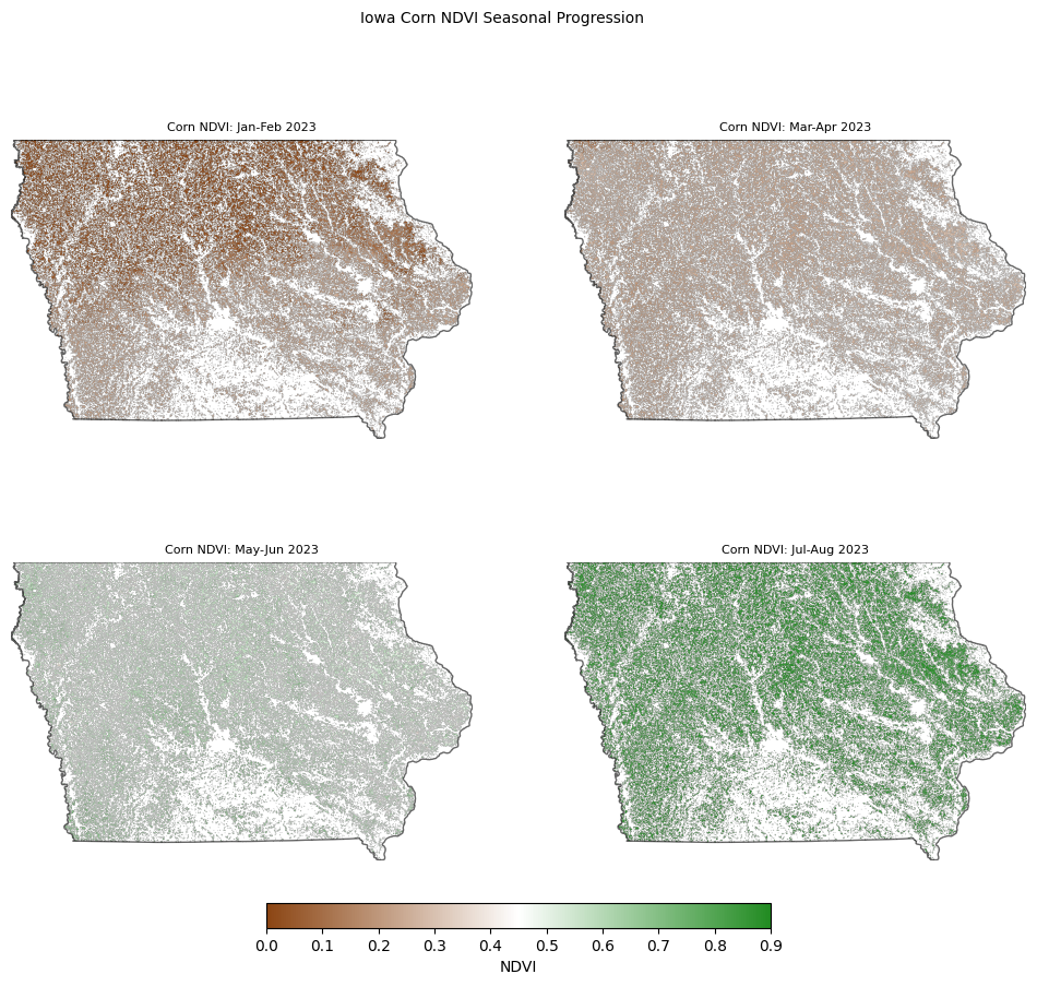
… the change in NDVI is much more subtle when filtering out anything that isn’t corn, but this just gives an idea of our signal for the time series …
Time Series for Corn NDVI
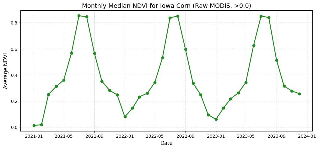
… use raw MODIS data for at least 4 data points per month and filter out values below 0.0 manually …
… use mean reduction for all NDVI pixels in the state of Iowa in a month … anything less brute ?
import pandas as pd
import datetime

mod09_col = ee.ImageCollection("MODIS/061/MOD09A1")
years = [2021, 2022, 2023]
months = list(range(1, 13))

features = []
for y in years:
    for m in months:
        # Start and end of month using ee.Date
        start = ee.Date.fromYMD(y, m, 1)
        end = start.advance(1, 'month')

        monthly_col = mod09_col.filterDate(start, end).filterBounds(iowa)

        monthly_median = monthly_col.median()

        # calculate NDVI
        ndvi = monthly_median.normalizedDifference(['sur_refl_b02', 'sur_refl_b01']).rename('NDVI')

        # filter below 0.0
        ndvi_filtered = ndvi.updateMask(ndvi.gte(0.0))

        # apply corn mask
        corn_ndvi = ndvi_filtered.updateMask(cdl_iowa_corn_mask)

        mean_val = corn_ndvi.reduceRegion(
            reducer=ee.Reducer.mean(),
            geometry=iowa,
            scale=1000, # 1km resolution to avoid computation limit
            maxPixels=1e10
        ).get('NDVI')

        features.append(ee.Feature(None, {
            'date': start.format('YYYY-MM-dd'),
            'ndvi': mean_val
        }))

# evaluate in a single request
fc = ee.FeatureCollection(features)
ts_data = fc.getInfo()

data = []
for f in ts_data['features']:
    props = f['properties']
    if props.get('ndvi') is not None:
        data.append({'Date': props['date'], 'Corn_NDVI': props['ndvi']})

df = pd.DataFrame(data)
df['Date'] = pd.to_datetime(df['Date'])
df.set_index('Date', inplace=True)
df.sort_index(inplace=True)

print("Sample Time Series Values:")
print(df.head())

# plot across 3 years
fig, ax = plt.subplots(figsize=(12, 5))
ax.plot(df.index, df['Corn_NDVI'], marker='o', linestyle='-', color='forestgreen', linewidth=2)
ax.set_title('Monthly Median NDVI for Iowa Corn (Raw MODIS, >0.0)', fontsize=14)
ax.set_xlabel('Date', fontsize=12)
ax.set_ylabel('Average NDVI', fontsize=12)
ax.grid(True, linestyle='--', alpha=0.7)
plt.show()
Sample Time Series Values:
Corn_NDVI
Date
2021-01-01 0.011683
2021-02-01 0.018431
2021-03-01 0.250304
2021-04-01 0.311735
2021-05-01 0.359863